GlitterIDE has a simple image editor for bitmap images (vector images planned for the future).
Clicking on the "Costumes" of the Stage or a sprite will reveal the image editor. This will look similar to the following:
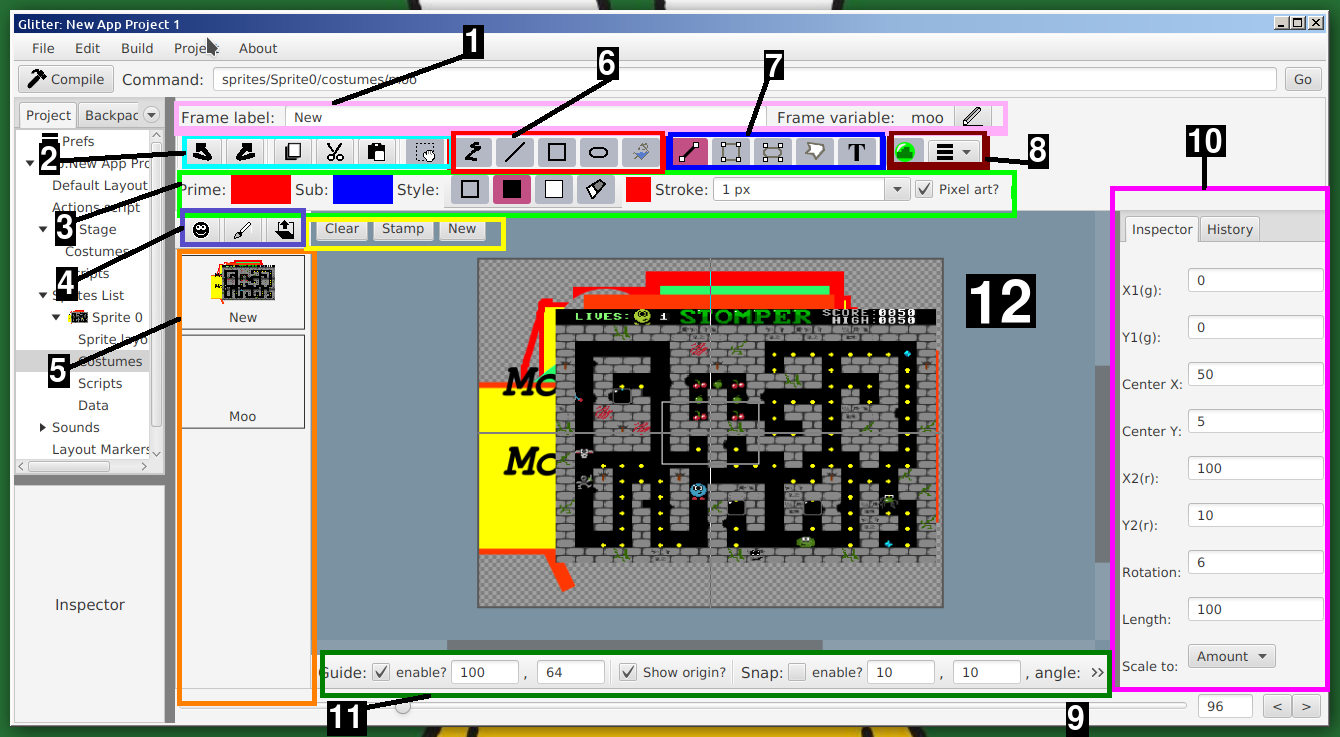
The Image editor is made up of multiple parts. Regarding the above image, the areas marked by coloured rectangles are as follows:
Labels may contain spaces and general characters. The frame variable is the recommended way to reference a frame. To change the variable, click on the pencil icon. Variable names are limited (only alpha-numeric characters and underscore, no spaces). To use a frame, like in the above screenshot with the variable name "moo", in code one would use "frames.moo.switch()", or "frames.moo.switch(x)". The switch function switches to the costume/backdrop. Passing an integer parameter will switch with an offset. To access backdrops from a sprite, use "stage.frames.var.switch()".
The first two items in the drawing style options area, are the primary and secondary colours. In general, only the primary colour is used, and the secondary (sub) colour is only used when using the "outline-fill" drawing option. To change the colours click on the coloured square and a colour chooser will appear. One can also drag on a colour.
The next set of items are the fill style options. The first, "outline", means to draw the outline of the shape only, while the next option means to fill the shape entirely. Both options use the primary colour. The next option is the "outline-fill", which draws the outline in the primary colour, and fills the inside of the shape in "sub" colour. All three options function the same on line and free-draw tools. The final option is erase, which will cause the drawing operation to erase to completely transparent. This works for any drawing tool (there is no dedicated erase tool). The small coloured square after the buttons is just a preview of the fill style.
The second to last item is the stroke size. The stroke is width of the outline.
The last option is the "Pixel art?" option. If this is enabled, no filtering/ant-aliasing is done, and the drawing options will be drawn in a "jaggy" style. Unselecting this option will smooth out the drawing options.
To edit a particular costume/frame, click on particular image to edit it. Moving over a frame selection button will also reveal a small cross in the top-right corner. Click on this to mark the frame for deletion. Frames marked for deletion will no longer be usable, and will not be saved in the project file. To return a frame that has been marked for deletion move the mouse over the image again, and click the return icon (in the top-right corner).
Clicking on these buttons will set the drawing mode to one where something is drawn immediately when clicking on the drawing area. From the left, the functions are "scribble" (free drawing), line, rectangle, oval, and flood fill. When using the flood fill option, select a target colour (the primary colour) and then click on a pixel in the drawing. The clicked on pixel will be a certain colour, and the flood fill operation will fill that pixel with the new colour, but also "flood" any other connected pixel of the same original colour.
Clicking on these buttons will set the drawing mode to one where what is drawn can be changed and fine tuned. The functions are line, rectangle and oval, as for the quick draw, but then a general polygon tool, and a text tool.
Structured tools can be repeatedly stamped, or removed. To "stamp" an operation, press the space bar, or click on "Stamp" in the yellow box bounded area. To remove the current operation, use the delete key, or click on "Clear". To keep the current operation, but restart a new one, use the escape key, or the "New" button.
Selecting the green looking circle will switch to the collider editor. Colliders describe what counts a collision between sprites. Currently only bounding circles and single points are allowed (future versions will expand this). The "hamburger" menu reveals some general toolls like centering the image, or clearing the image, but also the option to export the image as a jpeg (JPG), or PNG file.
Activating the guide, by clicking on the "enable?" checkbox, will show a guide box in the main area of the specified size. This can be useful if creating a drawing to a specified size.
Clicking the "Show origin?" checkbox will add two lines to the main area that meet at the exact center of the image. This is the point that is being refered to by the sprite's position.
The snap options will (possibly) restrict operations to certain pixel positions, and certain angles. This can help with making more precise drawings.
This is the area where the actual drawing is down. Useful tips are:
To be continued...
To be continued...
To be continued...
To be continued...